Font
font Load and use TrueType fonts for display text rendering
Official Documentation
📚 ESPHome Documentation →Overview
The Font component uses OpenType/TrueType fonts for rendering text on displays. It supports more but I’ll cover what I use. Main fonts I use are Google Fonts: Roboto, Montserrat, … and Material Design Icons font file.
Google Fonts I use for text in general, and Material Design Icons for … icons 🙂
Things to consider:
- Icons (and fonts) are monochromatic, you can color them, but they can have only one color … per character
- They take up space in your device’s flash so it’s important to use only glyphs you need
- The bit depth is important for anti-aliasing, greater bit depth, more space is used in flash, but fonts look better on bigger screens
Material Design Icons
To use icons like light bulbs, weather icons, car, … anything really, the easiest way is to use Material Design Icons. Alternative is to use image, and MDI images are pretty much the same thing, but I find font usage more convenient. For one, it’s easier to define list of icons - you just list all the glyphs you need.
Get the Font
To get fonts you can use these:
- Material Design Icons font file (download from CDN)
- For latest version: MaterialDesign-Webfont CDN
In the examples below I use: file: assets/materialdesignicons-webfont.ttf because I downloaded ttf to my assets directory. I’m using docker image so this would be in /config/assets. You can use file: "https://cdnjs.cloudflare.com/ajax/libs/MaterialDesign-Webfont/7.4.47/fonts/materialdesignicons-webfont.ttf" instead.
Glyphs?
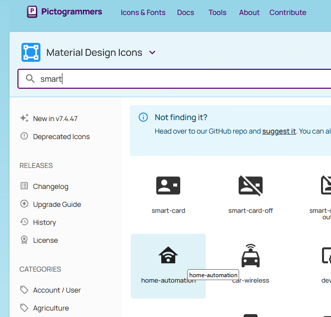
At pictogrammers you can search for icons, click on them and then you can click on “codepoint” to get unicode … code for the icon.
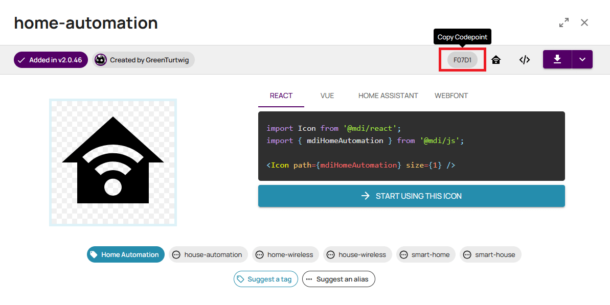
In the above example, for home-automation icon the code point is F07D1, to be able to use it you need to write it like this: "\U000F07D1"
From ESPHome documentation:
Code points up to 0xFFFF are encoded like \uE6E8. Lowercase \u and exactly 4 hexadecimal digits.Code points above 0xFFFF are encoded like \U0001F5E9. Capital \U and exactly 8 hexadecimal digits.
Examples
For icons, I usualy have 3 sizes and I give them IDs like: mdi_small, mdi_med and mdi_large. For different screen sizes I use different icon sizes, so for example:
| Display | Color | mdi_small | mdi_med | mdi_large | bpp |
|---|---|---|---|---|---|
| 320x240 | ✅ | 24 | 64 | 96 | 4 |
| 240x240 | ✅ | 24 | 64 | 96 | 4 |
| 128x128 | 🚫 | 24 | 32 | 48 | 1 |
For bigger and color screens it makes sense to use more bit depth (say 4) but for smaller screens it might make sense to go with 1. For monochromatic screens it does not even make sense to go beyond 1 bpp because they show only two colors so using bpp greater than 1 is just a waste of flash space.
BTW, there are only 2 rules around sizes of the icons: use what looks nice and be careful, bigger size means more flash space used.
Weather Icons
I use these all the time, and I even have a helper to map weather condition to icon: info-panel-28
fonts:
  - id: mdi_large
    file: assets/materialdesignicons-webfont.ttf
    size: 96
    bpp: 4
    glyphs: [
      "\U000F0594", # clear-night
      "\U000F0590", # cloudy
      "\U000F0F2F", # exceptional
      "\U000F0591", # fog
      "\U000F0592", # hail
      "\U000F0593", # lightning
      "\U000F067E", # lightning-rainy
      "\U000F0595", # partlycloudy
      "\U000F0596", # pouring
      "\U000F0597", # rainy
      "\U000F0598", # snowy
      "\U000F067F", # snowy-rainy
      "\U000F0599", # sunny
      "\U000F059D", # windy
      "\U000F059E", # windy-variant
      "\U000F14E4", # sunny-off
    ]
Other Commonly Used Glyphs
      # Lightbulb
      "\U000F0335", # mdi-lightbulb
      "\U000F0336", # mdi-lightbulb-outline

      "\U000F0F55", # mdi-home-thermometer-outline
      "\U000F0026", # mdi-alert
      "\U000F0238", # mdi-fire
      "\U000F1807", # mdi-fire-circle
      "\U000F0030", # mdi-amplifier
      "\U000F11B5", # mdi-amplifier-off

      # EV Car Icons
      "\U000F0E1B", # mdi-car-back
      "\U000F1904", # mid-home-lightning-bolt-outline

      # Climate preset mode icons
      "\U000F1A71", # snowflake-thermometer (frost)
      "\U000F032A", # leaf (eco)
      "\U000F04B9", # sofa (comfort)
      "\U000F14DE", # rocket-launch (boost)

      "\U000F0C52", # checkbox-outline (confirm)
      "\U000F0158", # close-box-outline (cancel)
      "\U000F0704", # plus-box-outline (increase)
      "\U000F06F2", # minus-box-outline (decrease)
Using The Glyphs
In display lambda:
display:
  - platform: ssd1306_spi
    pages:
      - id: page_info
        lambda: |-
            it.printf(it.get_width()/2, it.get_height()/2, id(mdi_large), COLOR_ON, TextAlign::BOTTOM_CENTER, "\U000F14DE");
The above is just printing Rocket Launch icon in the middle of the screen. In this case it’s a monochromatic screen, so the COLOR_ON is used for color. If it was a color screen, an actual color could be used.
In LVGL:
lvgl:
  pages:
    - id: dashboard_page
      widgets:
        - label:
            id: icon_amp_switch
            text: "\U000F11B5"
            text_font: mdi_med
            text_color: grey
The above is a very simplified LVGL page with just a label showing a crossed amp icon in grey color.
Google Fonts
Find the fonts you like at Google Fonts. You can search, or filter by appearance, feeling etc. Choose, then use 😉.
You will need family of the font, so some of the fonts you could use:
- Roboto
- Montserrat
- Open Sans
- Playwrite Norge
I just saw that last one on the Google Fonts home page 😁, but it looks cute, I might try it out some time. If the family name has space in it, just keep the space when specifying family: family: Open Sans
Usage Notes
A lot of what applies to Material Design Icons applies here to. Most notably - bigger font, more space it takes in flash. More different kinds of fonts and different sizes take more flash space. More bit depth … you guessed it: more flash space.
Some things are not as obvious, but default glyphset used is GF_Latin_Kernel, which contains the basic characters and necessary punctuation and symbols for the English language. This is important because if you want to use other languages then you need to include other glyphsets or you need to define glyphs you want to use. See ESPHome font documentation for more details.
In all the examples below, I just use the default glyphset, but if your device is constraint by the size of the flash, you might need to go frugal and define only letters and symbols you use. Flash is limited and precious asset - if you run out of it you won’t be even able to build your project.
Examples
Like for icons, I usualy have 3 sizes for text too, and I give them IDs like: value_small, value_med and value_large. I also sometimes add title fonts if I want a bit of a different look. For different screen sizes I use different font sizes, but I could use different sizes, depending on the project. So for example:
| Display | Color | value_small | value_med | value_large | bpp |
|---|---|---|---|---|---|
| 320x240 | ✅ | 10 | 16 | 28 (Bold) | 4 |
| 240x240 | ✅ | 10 | 16 | 28 (Bold) | 4 |
| 128x128 | 🚫 | 10 | 14 | 20 | 1 |
font:
  - id: title_med
    file:
      type: gfonts
      family: Roboto
    size: 16
    bpp: 4
  - id: value_med
    file:
      type: gfonts
      family: Montserrat
    size: 16
    bpp: 4
  - id: value_small
    file:
      type: gfonts
      family: Montserrat
    size: 10
    bpp: 4
  - id: value_large
    file:
      type: gfonts
      family: Montserrat
      weight: bold
    size: 28
    bpp: 4
The above example uses Google Fonts in an expanded syntax for ESPHome. There’s a shorthand for using Google Fonts, but I am using weight, for example, to make my large text with extra “boldness”. So I just kept it that way for all of them.
In the above example I use bit depth 4 because I found it prettier for larger fonts. I could’ve probably gone with lower bpp for smaller fonts. For monochromatic display use bpp: 1.
NOTE: Specifying font one way or the other does not affect the size of the binary produced. The specified size of the font, bpp, etc - that matters. Using shorthand syntax like file: "gfonts://Roboto" won’t make the smaller binary in the end because the yaml is just telling ESPHome information about the font.